Wednesday, 30 January 2013
Mock ups
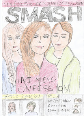
The above images are the original copies of my mock ups. Drawing these were very helpful as they help me to decide on how my models will be positioned and what way they will be interprited. This will also make me much more organised when it comes to doing my final pieces.
This is the front cover of my magazine. The band are positioned the typical way of bands on the front cover, the status triangle where the main singer is positioned at the top. When it comes to my final piece the models heads will be over the mast head.
This is the content page. The models are also featured on this and they make a banner for the top of the page. The different featured articles are written in categories so it is easy for the reader to find their way around the magazine.
This is the double page spread for 'chained confession'. The models are featured in a park which is typically british because they are a british band. The opening paragraph is written at the top then the rest of the text is written in article format. The article is a interview with the band where the magazine asks the band questions about their new upcoming album. The title of the article is a pull quote.
I photo copied all three of my mock ups so i could try out different colours and decide which was best suited. I found the best colours to use and coloured them in.
Subscribe to:
Post Comments (Atom)


No comments:
Post a Comment